Data-Driven Visualization: How to Use Fitness Metrics to Create Engaging and Informative Infographics
# Data-Driven Visualization: How to Use Fitness Metrics to Create Engaging and Informative Infographics
In an age where information overload is common, visualizing data has become an essential skill for anyone looking to communicate effectively. For fitness enthusiasts, data-driven visualizations can transform raw numbers and metrics into engaging infographics that capture attention and convey important insights. Whether it’s tracking workout progress, monitoring nutrition, or understanding health trends, infographics can present complex information in a digestible format. This blog post will explore how to use fitness metrics to create compelling infographics, along with nutrition tips, exercise advice, and health benefits related to fitness data.
## Understanding Fitness Metrics
### What Are Fitness Metrics?
Fitness metrics refer to the quantitative measurements used to assess an individual’s physical health and performance. Common metrics include body mass index (BMI), heart rate, calories burned, steps taken, and workout frequency. These data points offer insights into an individual’s fitness journey, helping them make informed decisions.
### Why Use Data Visualization?
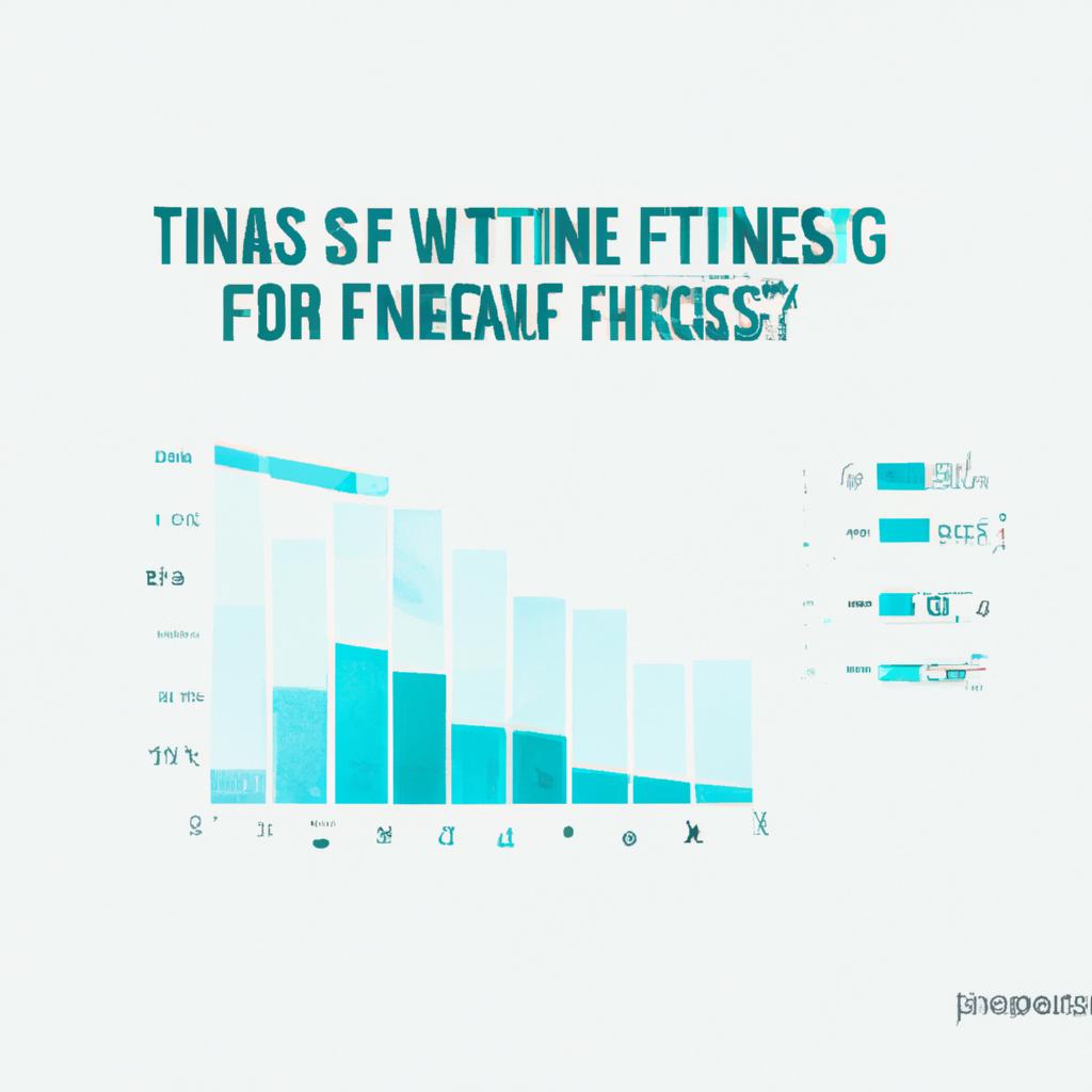
Data visualization enhances the storytelling aspect of fitness metrics. By presenting data visually, it becomes easier to identify trends and patterns. Infographics can highlight significant aspects of one’s fitness journey, making it more relatable and engaging for both the creator and the audience.
## Creating Engaging Infographics
### Selecting the Right Data
To create effective infographics, start by selecting relevant fitness metrics that resonate with your audience. Focus on data that showcases progress, challenges, and achievements. For example, if you have been tracking your weight loss journey, use metrics such as weekly weight changes, workout frequency, and calories consumed versus burned.
### Tools for Visualization
Various tools and software can assist in creating infographics. Platforms like Canva, Piktochart, and Adobe Spark offer user-friendly templates that can be customized to fit your data. Choose a tool that aligns with your design skills and the complexity of the data you wish to visualize.
### Design Principles
When designing your infographic, keep in mind the following principles:
– **Simplicity**: Avoid clutter and focus on clear, concise messaging.
– **Color Schemes**: Use contrasting colors to differentiate between data points while ensuring readability.
– **Hierarchy**: Organize information logically, using headings and subheadings to guide viewers through the data.
## Nutrition Tips
### Track Your Intake
To visualize nutrition effectively, start by tracking your daily food intake. Use apps or journals to log meals, focusing on macronutrients like carbohydrates, proteins, and fats. This data can be visualized through pie charts or bar graphs that show the percentage of each macronutrient consumed.
### Meal Planning
Create infographics that showcase meal plans or healthy recipes. Use images and icons to illustrate ingredients, making it visually appealing. Highlight the nutritional benefits of each meal, promoting better dietary choices.
### Hydration Matters
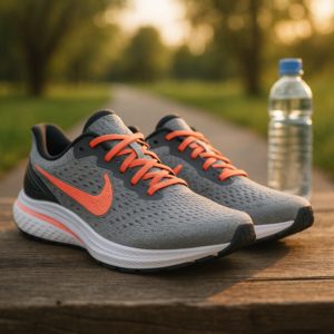
Don’t forget to include hydration metrics in your infographics. Visualize daily water intake and its relation to overall health. Use visuals like water bottles or glasses to represent hydration goals, encouraging viewers to maintain proper fluid intake.
## Exercise Advice
### Set Clear Goals
When visualizing exercise metrics, start by setting clear fitness goals. Whether it’s running a certain distance or lifting a specific weight, create visual representations of your goals through progress charts or timelines. This not only motivates you but also helps others see the importance of goal-setting.
### Track Workouts
Utilize data from fitness trackers to visualize your workout routines. Create charts displaying the types of workouts performed, duration, and intensity. Infographics can highlight the benefits of a balanced workout regimen, including strength training, cardio, and flexibility exercises.
### Share Success Stories
Incorporate success stories into your infographics. Use personal achievements or testimonials from others to inspire and motivate your audience. Visuals that show before-and-after comparisons or highlight milestones achieved can significantly enhance engagement.
## Health Benefits
### Improved Awareness
Data-driven visualizations promote better awareness of personal health metrics. By regularly tracking and visualizing fitness data, individuals can identify trends and make informed adjustments to their routines.
### Motivation and Accountability
Creating infographics can serve as a motivational tool. By visualizing progress, individuals are more likely to stay committed to their fitness goals. Infographics can also be shared on social media, fostering a sense of accountability within a community.
### Enhanced Understanding
Infographics simplify complex health information. By breaking down fitness metrics into digestible visuals, individuals gain a clearer understanding


Post Comment